The beauty of data

 By now you may know that I’ve become minorly obsessed with data visualization and network science as a result of my various adventures around campus. Of course, obsessed is a relative term and there are definitely some other folks here who have me beat in that department. Isabel Meirelles would be one of them.
We met for coffee last week and I fell further in love with the idea of communicating science and data to the general public through various media. My media of choice these days is writing, but I think Meirelles’ work in visual translation travels in the same vein. “I was fascinated by motion and interaction,” she said, explaining the impetus behind earning her second master’s degree at MassArt’s Dynamic Media Institute.
She started out as an architect in Sao Paolo, but after several twists and turns in her career, maneuvering through museums, magazines, and graphic design, she now teaches in Northeastern’s College of Arts, Media and Design, forming collaborations across college boundaries with people like network scientist Albert Laszlo Barabasi and speech and language pathologist Rupal Patel.
After earning tenure in 2009, she said, “I knocked on Laszlo’s door, and said, ‘I read your book, Linked and I really need to learn something new. I want to work with larger data sets. Can I get a PhD with you?'” Previously she’d used small enough data sets that she could do the visualization manually, but between the internet and new mobile devices, data was exploding and old techniques were not sufficient to deal with it.
Instead, Barabasi suggested they join forces. One of their first collaborations was the website design for his second book, Bursts.
Meirelles’ background in museum curation and arts education lends an obvious second layer to her interest in data communication. Not only does she design her own visualizations, she also curates network science gallery installations across the country.
Most recently, Meirelles organized The Art of Networks exhibit at the Florida Institute of Technology’s Foosaner Art Museum, with the help of Ronaldo Menezes, Associate Professor of Computer Science at Florida Tech and Director of the BioComplex Laboratory. The opening coincided with the 3rd annual Workshop on Network Science, CompleNet2012.
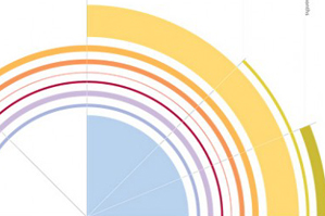
Meirelles chose ten projects that tell stories ranging from the online life of a New York Times article to the relationship between media coverage and government spending.
As we flipped through the images sipping our respective caffeinated beverages, I noted how beautiful some of them were. “They’re all beautiful!” she responded…
For me beautiful design or visualization is less connected to the general understanding of aesthetical beauty of what pleases one, and is more connected to how meaningful it is or how well we communicate the information. I truly believe that often times when that happens it becomes beautiful. Obviously the selection of the right colors helps, but also it’s a perception thing: If you select colors that don’t create enough contrast, you don’t see the data…[You need an] understanding of how we perceive visually and cognitively. That’s very different from works of art…which don’t have to be meaningful in this way.
For the fun of it, I’ve included this bit of our conversation below…more of an exercise in technology use for me, but also if you want to hear the passion in Meirelles’ voice as she explains the beauty of data:


