Money for the candidates
I just met one of the coolest people at Northeastern. His name is Mauro Martino and he’s the man behind most of the data visualization coming out of the university’s various network science labs. After spending a couple years at the MIT media lab, he joined Albert-László Barabási’s Center for Complex Network Research and David Lazer’s lab a year ago. Since then he’s been working behind the scenes to develop new ways of looking at the vast amounts of data available to the public.
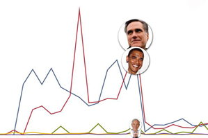
In honor of the election season, he teamed up with Lazer and post-doc Yu-Ru Lin to make the following visualization of the flow of money into the political campaign over the year between March 2011 and February 2012. Lin was responsible for most of the data collection and Lazer coordinated the work. Martino’s job was to tease the data apart and turn it into something digestible for you and I.
He didn’t want to make any statement about what the data means: “This isn’t to explain but to show what’s happening, because interpretation could go so many ways.”
This is only the beginning — expect a lot more from Martino in the coming months. There is more political data to look at — for example, which candidates company employees support and what parts of a city tend to fund one candidate over another.


