These data visualizations transform the magic of J.K. Rowling’s Harry Potter into something Muggles can understand

Share

Olivia Rouse has read the entire Harry Potter series more than 10 times. She’s attended book launch events, stood in line to get opening night tickets for the films in the franchise, and regularly visits the Pottermore website, which offers the latest news from the Wizarding World.
She was 5 when she saw her older siblings reading the books and insisted her mother read them to her.
Now she’s created a data-driven visual guide to all things Harry Potter as part of her senior project.
“I initially wanted to do eight large data viz posters, but I had too many ideas and couldn’t choose just eight,” says Rouse, a graphic designer who graduated from Northeastern in May with a Bachelor of Fine Arts. “And I wanted something I could hold onto in the future, so a book felt like the right fit for my portfolio.”
Equipped with extensive knowledge of Harry Potter—which became a global phenomenon when author J.K. Rowling released the first book in the fantasy series in 1997—Rouse got to work on what would become an 80-page hardcover book.
But no, her clever infographics didn’t just magically appear from waving a wand and casting an Aparecium spell. They resulted from months of research, planning, and execution in her “Design Project 1” and “Design Project 2” courses.
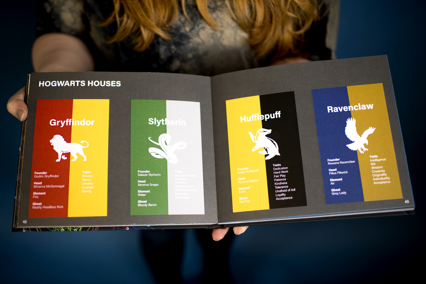
One infographic is a periodic table featuring various characters grouped by color to differentiate the ghosts, the Purebloods, the Muggles, the Dark Wizards, and more. Another, shaped like a pinwheel, shows how all the characters connect to one another. A third breaks down the colors most prominently featured on each of the seven book covers, with a focus on how the country in which the books were released impacts the color scheme.
“I tried to use as many different types of graphs as possible to show the range of infographics you can do in data visualization,” says Rouse, who created the graphics with Adobe Illustrator.
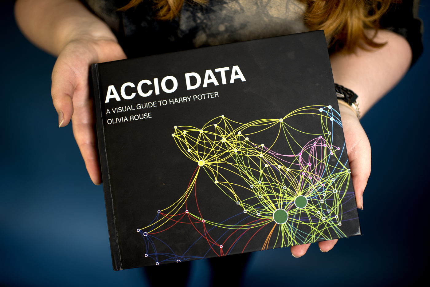
Her book is titled Accio Data, named after the summoning spell used throughout the Potter series. It was featured in the Art + Design Senior Exhibit at Northeastern’s Gallery 360.
Rouse says several people who saw the book at the show asked her how they could get a copy, so she started selling hardcover and paperback versions online. She also might open an Etsy store with posters, shirts, and other items featuring her designs—which she created from scratch.
On Monday, Rouse began a new job as a graphic design contractor for the Boston Planning and Development Agency, where she’ll be creating advertisements, flyers, and building wraps for construction projects.
She says that creating Accio Data has inspired her to pursue similar treatments for Game of Thrones, Bob’s Burgers, and The Simpsons.
Her Harry Potter project, she says, has taught her how to present complex data in a clear and concise way. She says she learned the importance of using the most applicable type of graphs and charts to display data.
“You have to left the data speak for itself, and choose wisely the best way to present it,” she says.