How artists transform data into art
The Data at Hand: Data Physicalizations of Earth and Space, is the first curatorial collaboration between Center for the Arts and Mills College Art Museum.

More than just numbers in a spreadsheet, data are variable, diverse and omnipresent in our daily lives.
And in a new exhibition, they are vibrant, sculptural and – quite literally – works of art.
“Sometimes just the visualization of data can be overwhelming,” said Juliana Barton, director of Northeastern’s Center for the Arts and University Art Collections and a co-curator of The Data at Hand, an exhibition at Gallery 360 on Northeastern’s Boston campus. “Giving it a physical form you can see and sometimes touch can counteract the data fatigue we experience and better help us understand the world around us.”
The Data at Hand: Data Physicalizations of Earth and Space is the inaugural curatorial collaboration between Northeastern’s Boston and Oakland campuses, uniting the Center for the Arts and Mills College Art Museum.
An opening reception will be held from 3 to 5 p.m. on Feb. 11 at Gallery 360. in connection with Love Data Week, which features more than 35 sessions on data, AI and analytics across the global network.
The exhibition will reopen in an expanded form at the Oakland campus in the fall.
Northeastern is well known for its information design and data visualization program. This show expands upon the idea of how to present data by exploring the concept of data physicalization — the translation of data into a physical form through traditional craft materials like fiber, wood and glass.

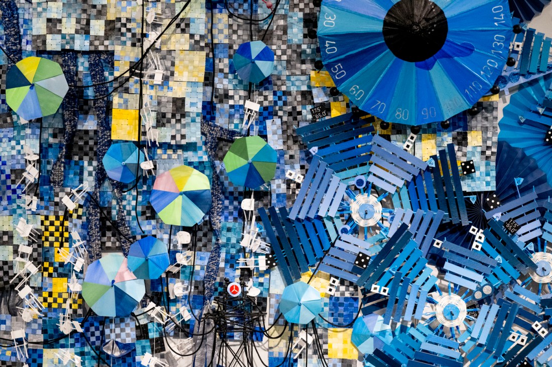
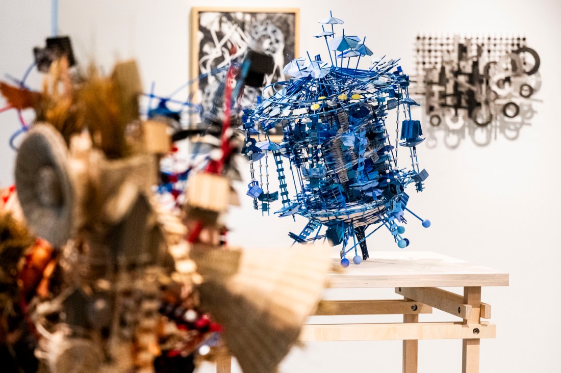
It’s a concept that artist Nathalie Miebach has been exploring for 20 years.
“A lot of data visualization is digital or two-dimensional but, even then, always a bit of an abstraction,” said Miebach, a Boston artist featured in the exhibit. “I’ve always tried to find ways to make information tactile, I’m a very tactile learner.”
For her work “Bird Sirens,” which was commissioned for the show, Miebach asks questions about the inequity of climate change and how different species respond to natural disasters. Orbiting rings in the sculpture evoke weather patterns and showcase Miebach’s background in basketmaking. Conic shapes suggest both the sirens that warn of an approaching tornado and the nests that the Swainson’s warbler — a bird species that prefers nesting sites in areas ravaged by storms — will build anew in the aftermath of the storm … an aftermath where human occupants, in comparison, often try to restore the homes and neighborhoods that existed before the disruption.
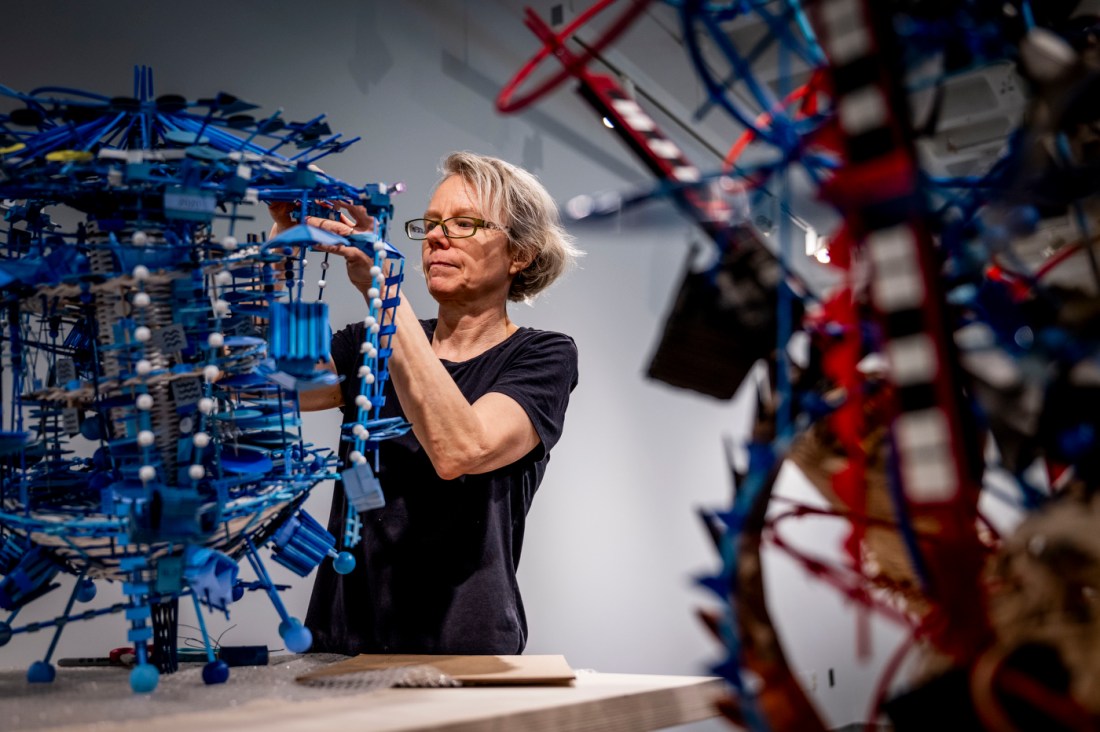
Miebach also translates data into music scores that can be performed — making the story not just sculptural or visual but sonic. The exhibit features the scores as well as recordings of the work.
“I think that in order to understand climate change, you can’t just use numbers,” Miebach said. “You have to understand complicated things ensuing from it, and give voice to them.”
Editor’s Picks


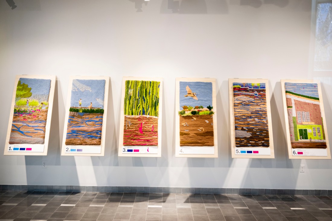
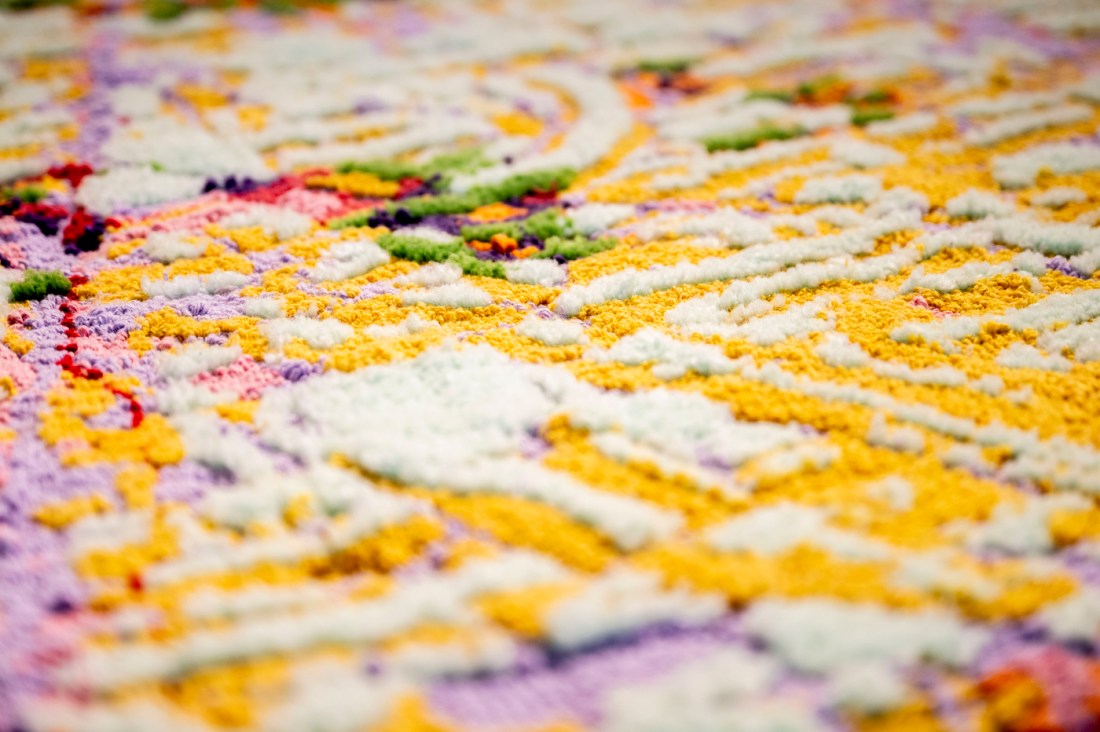
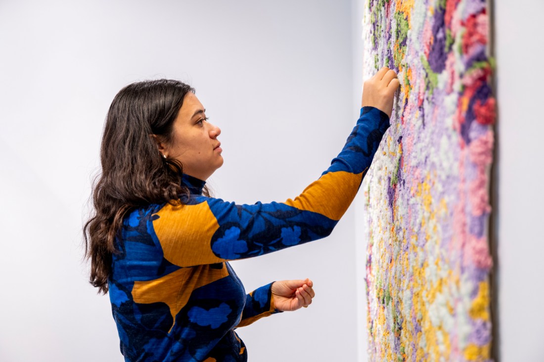
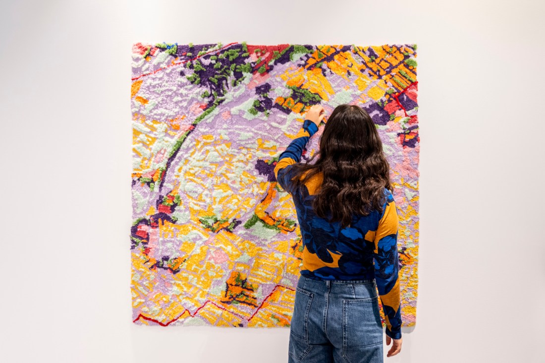
Just practice, an artist collaborative whose work is also featured in the show, presents data in a tactile way.
In “Soft City,” just practice artists Amanda Ugorji and Sophie Weston Chien use data to create large-scale textile maps of Boston neighborhoods, varying the color and size of tufts of wool to enable the viewer to see and “feel” data such as historical redlining boundaries or neighborhood tree canopy.
“You can have the tactile experience of what the vegetation is in minority neighborhoods versus more white neighborhoods,” said Barton.
Kayleigh Perkov, a co-curator of the exhibition, said she hopes that viewers of the exhibition understand that — whether in a lab or in an art studio — data is never “neutral” or “raw” but the result of many choices.
“The artists in this show often engage with that reality of how datasets are shaped by social values,” Perkov said. “Then also — on the flip side of that — they ask how datasets come to shape the world around us.”
Stephanie Hanor, director of the Mills College Art Museum and a co-curator of the exhibit, said the exhibition reflects Northeastern’s multifaceted and interdisciplinary approach to learning.
“I think Northeastern has a real strength in thinking about how to interpret data — whether that’s a scientist doing that work or, in this case, artists doing that work,” said Hanor. “We wanted to demonstrate that artists are working in a research mode that’s very similar to scientists, but presenting it through — in this case — more traditional craft materials and techniques.”


