He predicted the rise of COVID-19 cases. Now he’s helping contain the outbreak.
MUMBAI, India—When India instituted the lockdown of more than one billion people in late March, its COVID-19 infection rate was significantly lower than in the U.S. and China. But by early May, as a lockdown-weary nation prepared to ease some of its rules, its infection rates began to steadily rise. In the city of Ahmedabad in the state of Gujarat, Udit Bhatia saw this coming—in fact, his own modeling predicted it.

Photo courtesy of Udit Bhatia
Udit Bhatia, a graduate of Northeastern who now teaches at the Indian Institute of Technology Gandhinagar, has led the development of a new interactive dashboard to help Indian authorities understand the spread of COVID-19 in real-time and forecast infection rates based on multiple variables and scenarios. Bhatia says the model developed by his team of public health officials, including doctors and epidemiologists, and students was “always saying that if you lift the lockdown before the 30th of May, the cases are going to rise exponentially in the city of Ahmedabad.”
That is precisely what happened, and the city is listed as one of India’s COVID-19 hotspots; along with the city of Surat, it accounted for 75 percent of the state of Gujarat’s COVID-19 cases in June. Other large and congested cities, such as Delhi and Mumbai, have faced a similar sharp increase in numbers, leading to the return of more stringent physical distancing policies. Delhi has reinstated lockdown rules after easing them, and entire states, including Maharashtra and Tamil Nadu, have announced extended lockdowns until July 31.
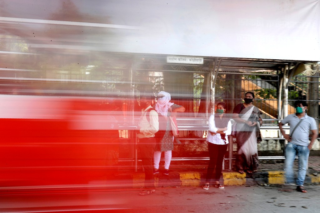
Despite these measures, the atmosphere is markedly different from when the lockdown was first imposed. Mumbai’s streets, eerily silent in March and April, are now bustling and filled with the familiar sounds of honking. Many storefronts have reopened in Mumbai, and people who went three months without haircuts are booking appointments or indulging in walks before the 9 p.m. curfew. Hotels and restaurants are also in the process of reopening, and people are now venturing outside with face masks for religious services.
Across the country thousands of Hindus visited temples on July 6 to honor one of their deities, Lord Shiva and his wife, Goddess Parvati, on a day considered especially auspicious. In Delhi, some temples were checking the temperature of each person before allowing them to enter. In others, priests were wiping down the idols with hand sanitizer.
India has the third-highest number of cases in the world, and like other nations, is grappling with how to contain the coronavirus outbreak without decimating its own economy. Liquor sales have been one avenue for regaining lost revenue, but once sales began again after the first lockdown, thousands of people waited in hours-long lines outside of storefronts. News sites featured stories and TV channels ran extended footage of the lines of people (almost entirely men), which circled blocks. In an effort to drive the crowds away, local governments started adding a “corona tax” to their sales; in Delhi, it was 70 percent, in the state of Andhra Pradesh, it was 75 percent.
In this complex landscape, predictive tools such as Bhatia’s dashboard have become even more important, both for officials trying to distribute limited resources, and citizens making daily decisions—such as which route to take to work.
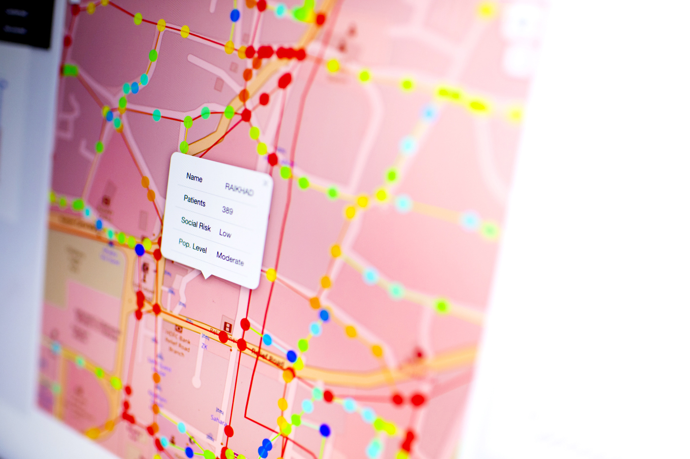
Bhatia and his team chose Ahmedabad as the test case for the dashboard, because the city is both close to their campus and densely populated. The dashboard gives the public, stakeholders, and local officials in the city real-time data as well as granular predictions for a variety of scenarios based on inputs including current COVID-19 data, epidemiological models, transportation patterns, population density, education levels, and rates of testing and quarantining.
The success of the model in Ahmedabad has prompted other regions both within Gujarat and nationwide to reach out for support as well. Researchers in the state of Chhattisgarh contacted Bhatia to collaborate on a similar type of dashboard for their cities, and Bhatia hopes to work with cities such as Delhi after more reliable data becomes available.
The dashboard, which is backed by a U.S. patent, already provides options for navigating in Ahmedabad that popular apps such as Google Maps do not. To contain COVID-19, the city government created “micro-containment zones,” which are regions that cannot be entered or exited except under strict parameters and are designated when residential housing societies report three or more cases; Bhatia says these nearly 100 zones “can be a few square meters to a few square kilometers.” With the dashboard “people can see, if they want to go from A to B, which areas to avoid altogether,” he says. This has real potential for other cities—Mumbai, for example, which has 750 containment zones across the city—and wherein intracity travel can be challenging and complex.
The transportation models provided by the dashboard have also led to important insights on containing the spread of the virus.
“Initially it was thought that population density would be one of the biggest factors in how this disease would spread,” Bhatia says. “However, the model indicated it’s not just population density, it’s also how well people are connected. The strength of the road network.”
When people are better connected through high-quality roads and bridges, and have access to popular and centralized meeting points, like malls and movie theaters, he says, they can more easily become vectors for disease. He calls this the “curse of connectivity.”
Local officials in Mumbai tried to limit movement for precisely this reason; for a brief period starting in late June, they instituted a ban against traveling more than 2 kilometers (1.24 miles) from one’s home and seized more than 7,000 vehicles from rulebreakers. This regulation has since been modified – now, people may travel “closer to home,” to shop for essential items.
One function of the dashboard is to predict these heavily congested zones and the most popular traffic intersections as people begin to resume their daily routines. As part of a series of recommendations submitted to state government officials, Bhatia and his team proposed establishing drive-through testing sites at popular intersections. “It was inspired by the South Korea model,” he says. “I hope [officials] realize this is the way to go, and we can get deeper inroads into managing the COVID-19 situation.”
As the Indian government continues to contend with the question of how best to balance public health and the economy, the dashboard has the potential to enable individuals to make smart decisions about their own safety. The dashboard can provide maps of where to seek treatment for COVID-19, as well as which areas pose the greatest risks. Raviraj Dave, a doctoral student who worked with Bhatia on the dashboard, says the data convinced him not to mingle with friends anytime soon. According to the model, he lives in a red zone with high infection rates, as opposed to a safe green zone or moderate orange zone.
“I’m not going anywhere,” he says, except to get groceries once a week.
Bhatia, who teaches courses at the Indian Institute of Technology Gandhinagar on the resilience of natural and manmade network systems, says that much of the high-profile work he is doing springs from his studies at Northeastern, where he received his doctorate in interdisciplinary engineering.
“We applied similar kinds of thoughts there and started thinking about what would help cities to manage the evolution of a pandemic better, at the city scale,” he says. “That’s how the entire idea of the dashboard originated.”
For media inquiries, please contact media@northeastern.edu.
