Apple Maps data shows how COVID-19 brought the world to a standstill

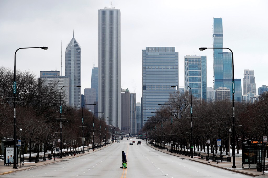
Photos of barren streets and empty subway trains have become regular images of the COVID-19 pandemic, and data newly made public by Apple Maps gives us a glimpse at how people around the world have stopped going out.
The chart below illustrates daily changes in requests for directions walking, driving and using public transportation (where available) made in the Apple Maps app. Each day’s total is represented as a departure from the number made on January 13, an average Monday before the pandemic.
Some of the patterns are predictable—such as seeing routing requests, in general, falling off a cliff beginning in March. We can also see some subtler cues, such as the usual weekly day-to-day spikes giving way to a more consistent, flat pattern. This data also helps to illustrate differences between areas; for example, the drop in Italy is about twice as great as that of Sweden.
Use the place filters and transportation-mode checkboxes to examine the differences and shifts for yourself.


