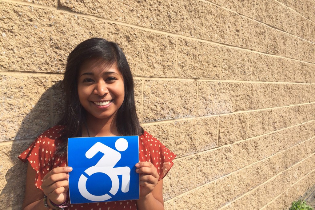
Why new wheelchair icon is more than just a symbol

Over the past several years, scores of disability rights activists have begun to question the efficacy of the ubiquitous wheelchair symbol, arguing that the white-on-blue icon depicts people with disabilities as passive, dependent, even mechanical.
Kimberly Izar, DMSB’16, is but one of the vocal critics of the International Symbol of Access, as it’s formally known. “People with disabilities are active and engaged members of the community,” she says, noting that one of her close family members lives with a mental disability and yet excels as an employee of a restaurant in Rockland County, New York. “They are not robotic.”
In January, Izar set out to bolster support for disability rights and started working at Triangle, a Greater Boston-based nonprofit dedicated to empowering people with disabilities. As one of the nonprofit’s three co-op employees, Izar planned events, penned press releases, and designed marketing brochures.
In February, Izar was tasked with planning a pop-up installation at a studio in New York’s Lower East Side. The exhibit’s main attraction was a redesigned version of the wheelchair symbol, a more active and engaging image set for permanent display at the Museum of Modern Art.
“I had to put the event together in two weeks,” recalls Izar, a fourth-year business major with a marketing concentration. “It took a lot of work, but I learned all about the icon and the history of the project.”
The project’s history dates back to 2009, when a Cambridge, Massachusetts-based artist and an assistant professor of philosophy at Gordon College started a guerilla street art project to spark a conversation, to make an artistic statement vis-à-vis the wheelchair symbol’s depiction of disabled people. By 2011, the duo had started placing hundreds of transparent stickers of their version of the icon over the old symbol on signage in their neighborhoods—and the statement started to morph into a global grassroots movement.
Today, the so-called Accessible Icon Project falls within the purview of Triangle, which has released the new symbol into the public domain. And though she had only been a co-op employee, Izar’s vast knowledge of the revamped icon—which looks like a person in the throes of the Boston Marathon’s wheelchair race—earned her the title of the Accessible Icon’s project coordinator.
Izar held the title from March to June, when her co-op ended. During that span, New York Gov. Andrew M. Cuomo made the accessible icon the legal standard in New York State; MOMA made the icon part of its permanent collection; and Jon Stewart, the host of The Daily Show, made a joke about the new symbol on Twitter.

The new accessibility sign is now on permanent display in New York City’s Museum of Modern Art. Photo by Rahul Desai.
On a local scale, Cambridge City Hall and the Boston Medical Center have adopted the icon. The Worcester Polytechnic Institute, UMass-Amherst, and Bentley University have also started using the new symbol while Northeastern, Izar says, has expressed interest in following suit. On a global scale, the icon has appeared in Italy, Korea, Australia, and even Malta.
“I’ve received so many photos, videos, and emails from people from around the world who want to show us where they have spotted the icon,” says Izar, who has remained part of Triangle’s team on a part-time basis. “Seeing how the project has grown globally has been pretty amazing.”
To her, the new icon is more than just a symbol—it’s a disability rights conversation starter. “The core mission of the project is not about spray painting lots and changing signs,” she explains. “It’s about having a conversation about equal rights and opportunities for people with disabilities.”


