Who’s paying for that?

 In the coming months we will be inundated with political messaging from a host of sources. This is always what happens in the period leading up to a political election and this time it’s no different.
Well…one thing is different actually: this time we can use new data visualizations from professor David Lazer’s lab to help us better understand the money behind the mouths.
Supreme Court Justice Antonin Scalia has said, “You can’t separate the speech from the money that facilitates the speech.” Lazer points out that a lot of that “speech” comes at us in the form of commercials.
“In a well-functioning democracy, an informed electorate should not just hear those commercials, but understand who is paying for him,” said Lazer.
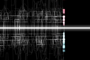
The new visualizations aim to help us do just that. Lazer’s team has turned billions of data points from the Federal Elections Comission–which requires all candidate contributions above a certain level to be recorded–into a manageable form. “The data processing and the visualization reduces the complexity to a point where people can interpret what is going on,” said Lazer. “These particular visualizations make certain things easy to see.”
The first video, which you can watch below, explains how to view these visualizations. Political contributions from employees of companies like Harvard Business School, The American Civil Liberties Union and Bain Corporation are visually associated with either the democratic or republican party. Each donator shows up as a little dot in either the top or bottom half of the screen. The distance away from the middle indicates how much they donated. If they switch affiliations or donate to both parties, they show up as a line crossing the center.
“It is easy to see the temporal ebb and flow of contributions,” said Lazer. “Whether people in an organization tended to move in the same direction and whether people are consistent in their relationship” are all conceptual take-aways that the visualizations provide above and beyond merely looking at the data (which would be incredibly boring and time consuming, anyway, since it’s just a list of billions of numbers).
After you watch the first video, you can go on to watch visualizations for each individual organization. There are currently eight, but Lazer hopes the public will engage his team in conversation and request visualizations for other entities.
You can see all the visualizations on their website, www.vispolitics.com. They will be adding visualizations every Monday between now and the election.


