Beautiful data continued

I woke up in the middle of a peaceful sleep last night only to begin fretting about the fact that I completely undersold Isabel Merielles’ show in yesterday’s post. Remember when I said the posters she chose were beautiful? Well why the heck wouldn’t I want to share them with you?! Very sorry. Here you go.
First off, an image of the space:

This first visualization is by Jan Willem Tulp of the Netherlands. It represents housing data from the 2010 census. Outer circles show the total number of homes in a county; inner circles show the total number of vacant homes in that same county.

Next up is by Justin Matejka, Tovi Grossman, and George Fitzmaurice from Autodesk Research in Canada, which focuses on the visualization of citations between research papers.

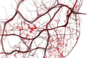
This one is my favorite. Created by Pedro Cruz, Penousal Machado, and João Bicker of the CityMotion Project in Portugal, it describes traffic in Lisbon over a twenty four hour period, with traffic jams represented almost as blood clots.

Wesley Grubbs of Pitch Interactive made this guy, which connects government spending across various agencies to media coverage of those agencies. For example, the proportion of money spent on defense is not matched by the media coverage.

And finally, since everyone loves a good cartogram, here’s our own Alan Mislove with a video of mood variations throughout a single day as expressed over twitter:
This is not all of the projects though, visit the rest of them here. They are all delightful.


