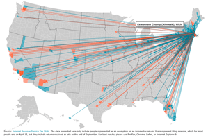
Where are Bostonians moving?

 Just had a chat with a network science dude and he told me about this cool website where you can visualize where people are moving to and from. It was created for Forbes magazine in 2008 around the beginning of the recession to give people a sense of the migration implications of the changing economic situation. It was updated in 2011.
You can click on any county in the US and it will draw blue lines for people moving to that area and orange lines for people moving out. Thicker lines represent more people.
Turns out people are moving to Seattle in droves and fleeing LA as fast as possible. NYC is a mix and Boston, sadly enough, has more orange lines than blue. Probably from all you students bringing your brilliance elsewhere after graduation.
Anyway, this is an example of data that network scientists can use to start understanding the implications of movement around the planet for the purpose of predicting things like the spread of disease and ideas.


