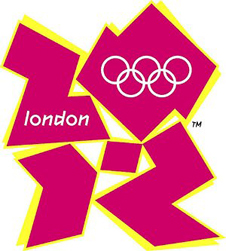
3Qs: Olympics logo: double meaning or just bad design?

When the International Olympic Committee unveiled its new logo for the 2012 Olympics, many criticized its zigzag-like block letter design: It looked like a swastika, or it resembled Bart and Lisa Simpson engaged in an unnatural act. Now the logo’s got another critic. Iran says the logo spells out the word “Zion,” and is threatening to boycott the London games if the design isn’t changed. John Kane, Northeastern art and design lecturer, discusses reaction to the Olympics logo and other logo controversies.
Is it typical for logos to be misinterpreted?
People who have time on their hands misinterpret logos constantly. As my colleague, adjunct professor Mark Laughlin said, “It’s like finding the Virgin Mary in a piece of toast.” In one example from 2005, there was a Burger King ice cream cone logo with a swirly design that some in Arab countries read as the word “Allah” being used in some heretical way. Burger King pulled it immediately. But typically, this kind of criticism is done more for amusement than some secret meaning. You have to be a little bit paranoid to think that this stuff is being done to convey a subliminal message.
What are some examples of logos that have actually intended to send a political message?
The brief history of graphic design is replete with examples of political and social propaganda — the work of El Lissitzky and Gustav Klutsis for the Soviets in the 1920s, Ludwig Hohlwein’s work for the Third Reich, Jean Carlu’s and Herbert Matter’s posters for the Allies during World War II, and the silkscreens of Paris’ Atelier Populaire in May 1968 all spring to mind. But anyone trying to equate this Olympics logo with what is no more than a marketing-driven branding exercise for a commercial endeavor really needs to step back, take a deep breath, and maybe a few eye drops. Sometimes bad work is just bad work.
How do logo designers make sure they aren’t creating an offensive image?
You do massive Google searches and you go to great lengths to make sure you don’t blunder into anything. I’m sure the designers of the Olympics logo, Wolff Olins, did their due diligence. If someone had thought the logo looked like the word “Zion” or a swastika or Bart and Lisa Simpson having sex, they wouldn’t have gone forward.


