Published on
Forget charts and bar graphs. Turn data into a play, ‘make them more human’
Working as the Data Theatre Project, this Northeastern collective explores ways to combine quantitative data and storytelling from a wide range of academic and artistic backgrounds.
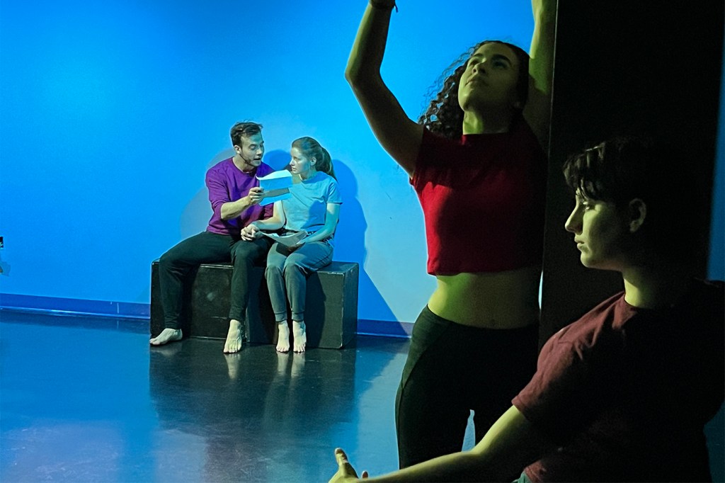
A soft recording of piano and oboe swells, and three actors walk across a dimly-lit stage. They’re in a park: one mimes going on a run; a couple sits on a park bench; another scours the ground, picking up plants and bugs.
“Greenways are high-quality active transportation and recreation,” one cheerfully recites. “Public spaces for walking, biking, and rolling for all people of all ages and all abilities.”
But that idyll, it quickly becomes clear, isn’t actually for “all” people. A pair of white joggers jostles a man played by Northeastern student Donovan Holt, a Black actor, who then sits, relegated, on the side of the stage.
“I open my mouth and redline my voice to silence,” he says. “That stuff ain’t built for us.”
Later on, Halle Brockett, a dual theater and sign language student, portrays a woman applying for affordable housing in Boston; another actor embodies the application form, reciting questions about household income and family size. After Brockett gives her answers, the “application” offers her a $1,750/month, one-bedroom unit… in Natick, 16 miles west of the city.
“NATICK??!” the ensemble exclaims in unison, drawing knowing laughter from the crowd.
These are snippets from a short play, conceived during a two-day workshop with an interdisciplinary group of Northeastern University students and faculty, about the tension between expanding green space (public parks, bike trails) and preserving affordable housing in urban planning.
“The tension is that often when you create programs like green spaces and community paths [in historically underserved neighborhoods], more wealthy people want to move in,” says Rahul Bhargava, a Northeastern professor and an architect of the workshop. “So there’s this unfortunate aspect where communities say, ‘Hey, look, we want these programs, but that’s also gonna mean I can’t live here anymore.’”
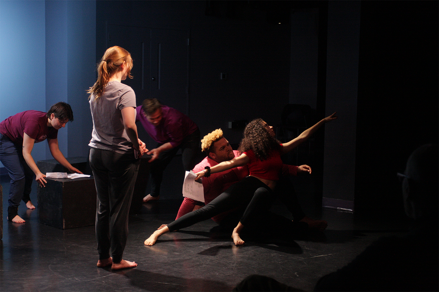
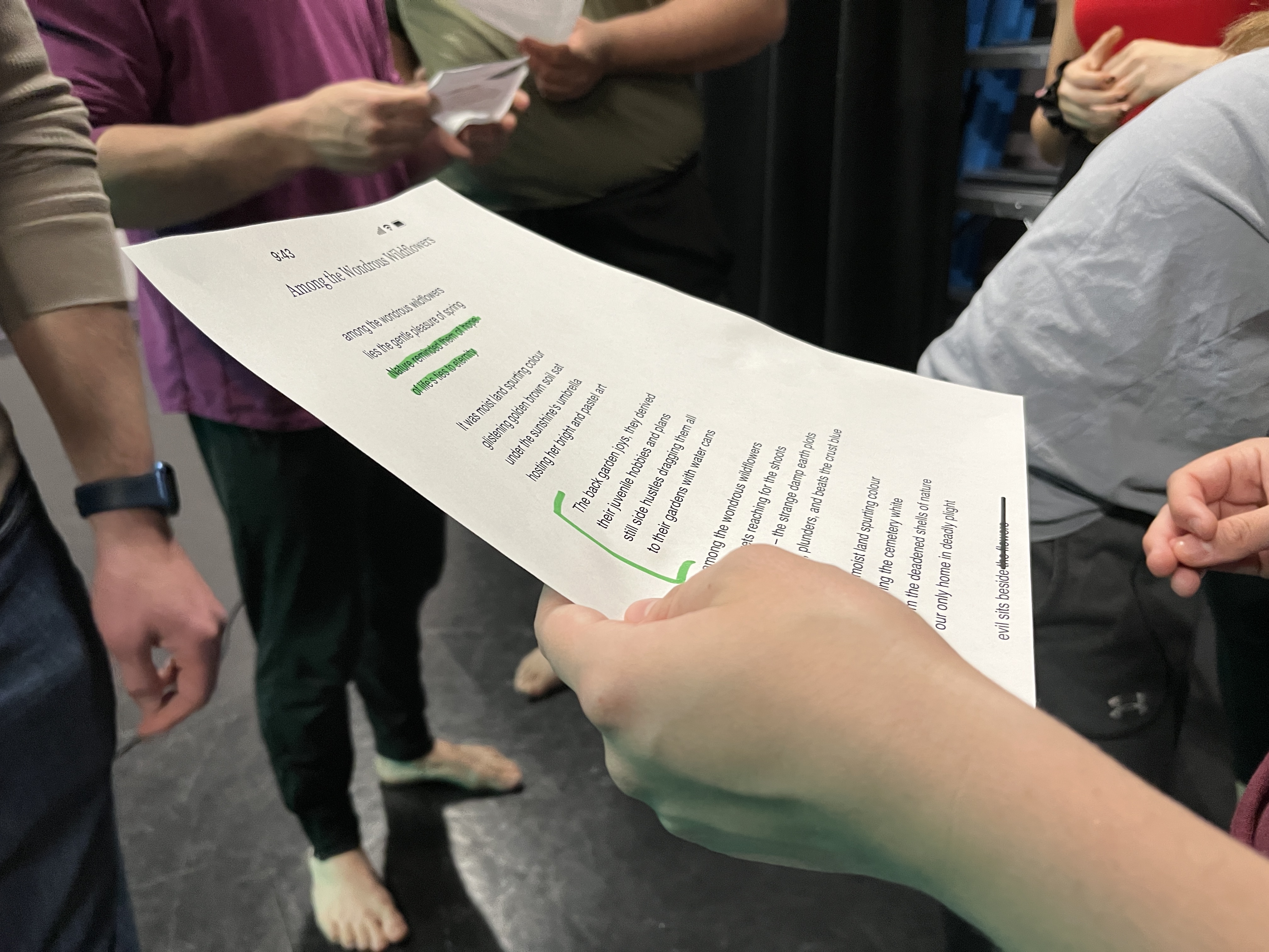
The source material for this piece isn’t the traditional narrative fodder—news stories, personal anecdotes, books, movies. It’s data. During the 10-minute performance in Ryder Theatre Lab, members of the student ensemble also quote statistics, parrot talking points from local community meetings and civic online forums, and arrange their bodies, together and separately, in visual representations of trends such as the rising cost of living and a disappearance of available dwellings. The materials came, in large part, from LivableStreets Alliance, a Cambridge-based advocacy organization for improving public spaces and expanding transit access.
The result was far from Broadway-ready. “This is a first stab,” theater professor Dani Snyder-Young advised onlookers before the performance. Rather, the piece serves as a prototype for the possibilities of making data—from urban housing statistics to climate change metrics or the prevalence of poverty—more accessible, understandable, and visceral through various forms of artistic expression.
Once mainly used in heavily quantified realms like science and business, “data is moving into areas that matter in social ways,” Bhargava says. “We have data being used in governance for small cities. We have data being used in libraries, nonprofits, newsrooms. These are all places that have different goals than the sciences or business, so we need to rethink who gets access to it, and how.”
A big part of the rethinking, he argues, should be in the delivery. “Usually data is presented with a person in the front of the room with a projector behind them. Research shows that when audiences see that, they’re less likely to ask questions. But in a community setting, you want questions.”
For performer Zeke D’Ascoli, who has acted in several campus productions and graduated in May from the Khoury College of Computer Sciences, the workshop was a rare opportunity to put the entirety of his multifaceted Northeastern education to use.
“We went through this pretty interesting procedure of trying to un-data the data points, and make them more human, as opposed to presenting it as numbers,” he says. “It showed me that there is a future direction where I can combine my background in computer science and data analysis and human-centered interaction with acting and make something meaningful.”
Working as the Data Theatre Project, the Northeastern collective explores ways to combine quantitative data and storytelling from a wide range of academic and artistic backgrounds. Bhargava, an assistant professor of journalism and design at Northeastern’s College of Art, Media and Design, studies data delivery through visual art: one of his projects, 1,659, is a sculptural representation of Massachusetts food stamp applications, made out of spoons. Snyder-Young has a background in dramaturgy and participatory theater, or performances that typically involve audience interaction. Jonathan Carr is a director who recruited the student performers from one of his acting classes in the theater department.
At Northeastern, “We’re really uniquely set up with the infrastructure to do this kind of work,” says Snyder-Young. She says that’s because the university encourages faculty and researchers to collaborate across academic disciplines—even when they don’t seem to go together. “My field [theater] is super-skeptical of quantification because it strips out human context: the emotions, the relationships. But at Northeastern, the work is going to have a heavy data literacy inflection.”
For that, Moira Zellner, a public policy professor and data scientist, put the group in touch with Abby Jamiel and Amrita Sawhney from LivableStreets.
“In the past, we’ve done reports finding things like racialized [nonwhite] people in Boston, on average, spend 64 more hours per year on public transit than other people,” Sawhney says. “That’s a really startling number. So what does that feel like when you’re spending 64 more hours on the bus? What do you not get to do in your day because of that? Working with the Data Theatre Project, she says, led to stories and feelings about those sorts of formerly abstract numbers. “Doing this was super cool, because I’ve never thought about that as a method before. I felt like it opened up new doors for us.”
For the workshop, the collaborators brought in survey data about local parks, drawn from residents in Boston neighborhoods such as Jamaica Plain and Roxbury—questions about favorite park activities, what might prevent someone from going to the park, and more.
“We had to understand the data before we could make something out of it,” says Brockett. “So for the first day, we were really just looking at the data and doing exercises that could help us engage with it.”
Distance often prevents people from going to parks, the survey found—so in the piece, distance became a prevailing theme, through outstretched hands or bodies moving apart. Other manifestations were more direct. In the data packet the group used, one chart showed a decrease in income-restricted housing units in Roxbury between 2020 and 2023; in the performance, the actors moved large blocks offstage to represent their disappearance.
“We did a very literal chart on stage, which ended up being quite touching,” says Carr. “There were people in it, and we could see which people were saying which things. And that idea, that we could create a character and an emotional relationship from the audience, just from raw data, is really inspiring.”
It showed me that there is a future direction where I can combine my background in computer science and data analysis and human-centered interaction with acting and make something meaningful.
Zeke D’Ascoli, a graduate from Northeastern’s Khoury College of Computer Sciences
The approach has potential pitfalls, however. Theater’s ability to elicit emotional responses and empathy can easily manipulate and mislead, in the wrong hands. And in the wrong contexts, Sawhney says, people might just as easily tune out a performance as they would a PowerPoint or a pie chart.
“When you put that in front of a community member who doesn’t really have a choice, the idea of doing like a dance can almost be like, ‘why are you wasting my time?”’ Sawhney says. She thinks success would depend on introducing the concept gradually, managing expectations, and being selective about which audiences might respond best to it.
Still, Jamiel thinks data theater has potential as a bridge between LivableStreets’ different audiences. “We often serve as the intermediaries between grassroots organizations—people on the ground—and those with power,” like city governments and foundations, she says. “We need to be able to have these really heady quantitative conversations with people who understand these nitty-gritty metrics. But then when we move back to the community, it’s really about storytelling.”
And in terms of storytelling, theater has singular, powerful advantages. “It gets people physically in a room, and gets them to turn off their phones and stop multitasking and focus on a story for an hour, or an hour and a half, or two hours,” Snyder-Young says. “There are so few spaces in our lives in which we do that.”
Schuyler Velasco is a Northeastern Global News Magazine reporter. Email her at s.velasco@northeastern.edu. Follow her on Twitter @Schuyler_V .

